Wednesday, December 8, 2010

Week 16 - Final

++
+
=
* *
CRAFT:
First I took the photo looking out the window and used the polygon lasso to crop the photo to just the window/window sill. I then took the image of the keys and used the same tool to crop the key, which I rotated to be sitting on the window sill. I took the image of the church and transformed it to the size desired and made it the bottom layer. I used the cutout filter on each layer to get the pain daubs for the building, mainly. I then used the various brushes I made to recolor and add texture. I dabbled with the hues to make the image dreary and dark. I used my circle brush to put the thick black outline behind the window areas. I used a brush set up with size, shape, and color variation to create the lava spewing from the mountain. I then used the lasso tool to draw outlines for the yellow bursts of energy and the smoke. I used my plastic brush in different colors to create the smoke. Then I used my stick figure stamps and positioned/resized them where I wanted them to create the scene. I created the yellow glow the same way as the smoke, only I colored the selection yellow, then used my brush as an eraser to get the faded effect. I applied a drop shadow to the "evil" stick figures, and a glow to the heroes.

CONCEPT:
The title of my piece is "Super Sticks." The concept is that there is this fantasy world of stick figures who are capable of anything. The evil stick figures on the window sill are trying to prevent the princess stick figure from escaping the castle by ridding the key to free her. Without her freedom, she will parish in the lava. However, the glowing stick figures are saving the day by keeping the key safe, stopping the lava, and swooping down to save her. The viewer of the artwork is looking out of the window, seeing this crazy alternate world where stick figures run crazy.

COMPOSITION:
I altered the hue/saturation of the image to make it seem somber. I positioned the church to occupy the majority of the empty space in the window, as its one of the main focuses. I used dark, dreary colors to give the artwork a hopeless, depressing feel. I positioned the key in the bottom left corner to utilize the space given on the window sill. I chose red for the bad things in the photo, as it is a menacing color to me. The hero's have a glow to them and a force making their superiority seem evident. I also selected to make them larger than the bad stick figures. I also added more "bad" events than good to create the idea of hopelessness, though the "super" sticks, with their glowing outline and yellow energy bursts seem to bring hope. And of course, the female figure is pink--a stereotypical girl color, and she needs saved as in many storylines. I used the bold black around the window area to create a frame for the image that draws the eye inwards.

Special Edition - Extra Credit


CRAFT: I had an image of Charles chugging wine, so I cropped him out with the magnetic lasso. I had to recreate a portion of his jacket with the clone tool, as well as use the distort tool on the hand holding the bread. I found a loaf of french bread and cropped it from it's original image, as the same with the beret, cheese, snail, and frog. I used the transform tool to alter the shape and angles of the various items. I used the eraser to clean up all of the edges and I used the text tool to write "il est stinky..." and the shape tool to make the bubbles. I applied a few filters to the entire image to make it fit together a bit better. I then added the frame by selecting a portion of a fence from another image and rotating and duplicating it. I added shadows to the frog and snail sitting on the frame. I drew the mustaches on Charles and the frog with a soft black brush, then applied a slight blur. And lastly, I created the smoke on the cigarette by drawing a thin gray line, then applying guassian blur. To finish, I adjusted hues/saturations to make the image fit together better.


CONCEPT:
I simply wanted to piss my French flatmate off, so I thought of every stereotype that I could execute visually.

COMPOSITION:
"Francy Pants"
Because I was unable to shoot all images myself, nor planned this project, I had a difficult time making the final product appear real, without any doubt. I decided that I would make everything look very glossy and bright to create unity, but still a level of believability. The viewer can imagine this happening. I positioned the bread, snail, frog, and background image, etc. in places that I thought balanced the image the best. The word bubble fell where it did because in the original image, there was a person's head there. I brightened the bottle and the drops falling from his mouth to make it noticeable. I put a red beret and bottle to make draw the eye there, then follow down the image. Everything I added to the image was to enforce the stereotype.

Week 15 - Portrait


CRAFT:
I began with an image of myself. I made it the background of the photo. Then, starting from the furthest object to the closest, I began painting the shadows. I would use the eyedropper to select a matching color, create a layer, paint that whole entire object the one hue, then create a new layer, eyedrop, and repeat until I had basic cutouts of the photo. I then started flashing the original photo on and off, making marks on a new layer to create shadows/highlights. Once the person looked recognizable, I just adjusted the hues of the various layers to make the colors match better.

Thursday, November 25, 2010

Week 14 - Brushes Only


CRAFT: I created two brushes -- hands and a dove. The image of the dove was obtained from a friend and the hands are one I took myself. To create each brush, I created a 2000 x 2000px canvas in grayscale. I used the various selection tools to crop the specific portions of the image I wanted. I then copied it into the new canvas, resided as needed, then created a brush. I then created the canvas for my project. I colored the background a rich crimson. I then created a layer above the background where I selected white and used my hand brush. On another layer, I selected a deep gold and created the dove. I created another layer and found some sparkle brushes. I used a 2 large sparkle brushes to create the shine coming from the hands, and the glow in the corner. I then selected different style sparkle brushes and made their positioning scattered and their size dependent on the pressure of my pen strokes on the tablet. I generated the streaks of sparkles from the hand around the dove. I then went back behind these 3 new layers to complete my background. I found a circular brush and selected a purple. I then created various layers of this brush at different hues to center in on the dove. The purple overlapping the red achieved some very pretty effects. I then did the same thing with black circles around the hand and added a golden glow by using a very soft edged brush.

CONCEPT: The concept was magic. When I think of magic, I think of white gloves, slight of hand, doves coming from nothing, etc. Colors I associate with magic are reds and golds and purples. If I could see magic happening, I would imagine it to be like fairy dust in movies--shiny and luminescent. I decided on the concept of magical hands. The hands have a magic stream coming from them, spreading out to generate a dove. I want the viewer to imagine that the dove is somehow released from the hands, and with the colors and luminescence used, that the transformation was magical.

COMPOSITION: The colors I use in the image remind me of magic. Magicians typically wear white gloves, so I made the hands white and since they are magic hands, all of the "magic dust" stems from them, so the glowing white sparkles emulate from the hand to the dove. The hands are positioned to resemble the shape of the dove flying. The background is red and purple because I feel those colors are befitting of the theme. The hands are the most important part and I want the eye to see the hands, then trace the magic stream to the dove. By using white, I think I achieve this. The dove is a deep gold, which still contrasts from the other colors, while still making it seem enchanted. I used the blacks near the hands to make the white seem brighter and add some balance.

Wednesday, November 24, 2010

Week 13 - Organic and Manufactured


CRAFT: I used the scanner to obtain images of manufactured and natural items. I scanned a fallen leaf, a dandylion, and a leaf stem plucked from a bush. I used 300dpi. I then cropped the items away from their background with the magnetic lasso tool. I scanned some mesh flowers and my sweater at a larger dpi to get more detail in the woven materials. I created a mask from the fallen leaf and used it to create leaves out of the manufactured materials. I scattered them about the whole background layer of my project, resized, and reduced their saturation and altered their hues to make them naturally colored, though artificial. I copied the dandylion head and duplicated it, rotating each flower to the correct angle to make a circle. I applied a filter to the entire group to increase the hue and saturation. I used the original fallen leaf and copied a circular portion of it to create a background behind the circle of flowers. I resized it as needed. I used liquefy to alter the shape of the leaf stem to make it look more like a peace sign. I again altered the hue/saturation to achieve the desired result. I then applied drop shadow to all of the natural items to make them stand out from their background. I then applied an opaque rainbow gradient over the background layer.

CONCEPT: The assignment was to merge natural and manufactured textures while maintaining a level of recognizable realism. Upon seeing the leaf stem , I thought it resembled a peace sign. Since it was a natural texture, I decided on Peace is Natural. I created the iconic peace sign out of all of the natural materials I obtained. I did not alter them greatly from their natural color because I wanted the realism. I used masks of natural leaves to create cut outs from the manufactured textures. I created a background that resembled nature, but was obviously not composed of organic material. I then added the rainbow gradient to overlay the background because I associate the idea of peace with a lot of color. I thought it helped convey my theme.

COMPOSITION: I gave the manufactured leaves very natural looking hues because I wanted a level of realism even though the items were not organic. I rotated and resized the leaves to make sure that their key parts, such as the stems, were visible and not hidden under the peace sign. I wanted it to be obvious that the background was made of a leaf shape. The peace sign is centered. The dandy lions are the brightest because they are the first thing i want to be seen. Then the eye follows to the green stem within to formulate the peace sign. However, before that correlation is made, you see the flowers...the natural portion. Then with the addition of the stem, the recognizable symbol of peace is formed. Then the eye trails from the brightest portion of the image to the background, which lies apparent that it is not made from the same materials as the peace sign. The title, "Peace is Natural", also conveys this message.

Sunday, November 7, 2010

Week 12 - Photo Recolors


CRAFT: I used my camera to take photos of shoes. I converted the image to grayscale and enhanced the vibrance of the shoes. I set it to multiply, then created a layer behind it in a dark orange. I created a layer above it with a lighter, and then a nearly white variation of the same color and used the paintbrush on the different layers to paint the objects I wanted to enhance. I then used a combination of an eraser with a soft edge and the magnetic lasso tool to trim the color that fell outside of the lines. I used brightness and contrast to brighten the lights and darken the darks until I got my desired result.

CONCEPT: I really enjoy shoes and the idea of viewing the world from the same level as them. I wanted images that were interesting so that I could enhance different parts of the photo to draw attention to details. I chose shoes to be my most important part of the photo with the things they see as the secondary.

COMPOSITION: All of my photos are from angles near ground level of whatever the shoes are on. I made sure to take layered images so that I had different things to look at. I tried to make the shoes the largest portion of the photo, even if they were not the largest thing in the photo. I selected interesting angles on the shoes to try to make the photos more interesting and I tried to keep the poses natural.

Monday, November 1, 2010

Week 11 - Misfit Toy Advertisement


CRAFT: (See Week 9 for Barbie's craft)
I took an image of the McDonalds Logo against a white background and used the magic wand to remove the white. I then used the text tool to add the "Brought to you by" and the eyedropper to select the proper red from the original logo. I merged the 2 layers and applied an outline. I used the text tool to create "Barbie" and applied an outline and drop shadow. I used text to create "Supersize Me" and used the eye dropper to match the yellows and reds to the McDonalds logo. I added a bevel and red outline, as well as drop shadow I used the text tool to create"Bigger Barbie, Bigger FUN!". I used Character to resize and tamper with the width of the letters to create the enlarging effect. I used traditional Barbie pink from the bathing suit and added the same pink outline as the Barbie logo. I then added 2 more layers with the McDonalds colors. I then added the text "Includes 1 FREE meal" and englarged the 1 FREE and made it the Mcdonalds yellow, rather than the red. I beveled both and then added a drop shadow to just the words "includes" and "meal".

CONCEPT:
I created an overweight Barbie themed along the idea of McDonalds, since McDonalds fast food is associated with obesity. I wanted something taboo that nobody would buy, but I wanted to sell it as if it were an amazing toy. I've heard the phase Bigger is Better, so I did a spin off on it with "Bigger Barbie, Bigger FUN!" In order to put understanding behind the large Barbie, I incorporated the McDonalds theme into it with their logo and colors.

COMPOSITION:
I examined a few Barbie advertisements and the one that was the most striking to me had an image of the Barbie's face only along the whole side of the ad. In the white space was the text selling the doll with the catchphrase and the logo at the bottom right. I borrowed this idea to create my ad. I wanted to be sure that the Barbie's size was apparent in the advertisement so I chose to use her whole figure. I wanted her to be a large portion of the ad, since she is large. I incorporated Barbie colors as well as McDonalds colors in order to create consistency. I made the slogan the largest text in the ad aside from the Barbie trademark because to me, the slogan sells the toy. I tried to balance all of the colors, especially the pinks, throughout the ad, hence the pink background. I made the text "Bigger FUN" the largest to emulate the text being bigger.

Sunday, October 31, 2010

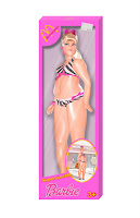
Week 10 - Misfit Toy Box

CRAFT: (see week 9 for how Barbie was edited/created)
I made the box by using the rectangle selection tool to create a reasonably sized rectangle for the barbie. I chose a pink that matched her bathers and colored the box in. I then used the selection tool to remove a rectangle inside the box to show the barbie. I used the circular selection tool and the polygon selection tool to create the angled edges and circles in the box. I created the bottom and sides with the rectangle selection tool. I made them a reasonable width for the barbie, then skewed them to the proper angle using the measurements. I altered their saturation and lightness accordingly. I created a solid grayish pink background and added a drop shadow to the barbie, and the front layer of the box. I cropped a McDonalds logo from a solid background and added a drop shadow. I use text to create Barbie and Supersize Me, then applied an outline and shadow. To make the image in the bottom right circle, I removed the inside of the circle and put an image of a McDonalds in the circle with Barbie over it and added a shadow to her. I made the plastic on the box by creating a layer and using a gradient fill with white to background and low opacity. I then added a new layer and used white to draw lines of different width across the box and then blurred them and lowered their opacity to create the glare. I made the price tag by coloring a rectangular selection a pink-ish gray and applying a texture to it. I used a text i thought comparable to an actual price tag and added the text. I rotated the layer accordingly then added a drop shadow.

CONCEPT:
I wanted to create a toy that wouldn't be purchased because it sends a poor message. If children are playing with McDonalds Barbies that are extremely large compared to the idealistic Barbie figure, it sends a message that Barbie is ok fat. Little girls play with skinny, pretty toys and they want to look like them. If they are playing with large toys, they may be more accepting of their bodies and be reassured that it is ok to eat fast food, even if you gain weight.

COMPOSITION:
I selected a Barbie with an angle that would enhance her enlargement the best. I tried to make the box fit very snug to her, but not so much that you couldn't see her features or seem unrealistic. I replaced the usual Mattel logo with the McDonalds M because McDonalds is associated with obesity and they also have the "Supersize" option, which is what I was playing off of. I kept the box as close to the original Barbie boxes (inspiration) as far as color and design was concerned. I added a few McDonalds colors to amplify the fact that this Barbie is McDonalds, not any other company.

Special Edition Blog


Art Institute


3 Artworks that inspire me & their Craft, Concept, & Composition


CRAFT: Adriaen van der Spelt & Frans van Micris collaborated on Trompe-l'Oeil Still Life with a Flower Garland and a Curtain. The artwork is done in oil paint on panel. Adriaen van der Spelt made the original painting and then Frans van Micris added the shimmering curtain.

CONCEPT: Dutch collectors sometimes use curtains to protect particularly exquisite paintings. The creators of this image alluded to this. The title Trompe-l'oeil means "deceive the eye" which is what the painters were trying to acheive with the curtain. It almost looks like you could grab it and pull it back to reveal more of the painting.

COMPOSITION: The flowers and garland appear to be obviously a painting but the curtain looks incredibly realistic and draws the eye to it. It obscures a third of the background painting making the viewer imaging what the remainder of the painting may look like. The background is darker and more subtle colors which makes the shimmery curtain pop out.


CRAFT: Jacques-Antoine Volaire, The Eruption of Vesuvius, 1771. The painting is one of many that the artist did of the eruption. It is done in oil on canvas. There is a contrast between warm and cool colors in the image. The entire image is relatively dark, but the lava illuminates the left portion of the painting, where the moonlight illuminates the sea on the right portion. The canvas is fairly evenly shared between both scenarios, though the volcano seems to be encroaching upon the serene night by the way the artist trailed the smoke and lava river.

CONCEPT: Vesuvius was a popular attraction for travelers on the Grand Tour of Italy. During the time of the painting, there was much reflection of the volcano's activity at that time. There was a major eruption the year this work was painted. This painting was also fueled by the Enlightenment interest in science and philosophy and literal notions, such as the terror created by nature.

COMPOSITION: The artist draws the eye to the spectacular eruption of Vesuvius and then leads it to the sea, where the lava is cooling. The right have of the image is very peaceful, where the left is using more destructive colors. Silhouettes of people who appear to have made it to safety seem to be spectating. The couple in the bottom right look to be climbing the hills with the ones in the center looking in shock and awe. The individual at the far left looks to be recording the events, perhaps mimicking the artist.

CRAFT: Conrad Felixmuller, The Death of the Poet Walter Rheiner, 1925. The painting is in oil on canvas. The entire painting is very dark and chaotic, yes seems to glow from within. There is a lot of action taking place in the background developing the city of Berlin. The painting is very stylized with many angles. The lighting plays and important role and rather than being subtly blended to create the glows, the artist used what seems like swift, solid lines in bright colors to emulate the glowing.

CONCEPT: Felixmuller painted the image after learning of his friend's death. The man is falling against the chaotic background of Berlin representing the struggle of the individual in the modern world. The artist inserted his face in place of Rheiner's to relate his own inner conflicts about the postwar (WWI) existence. The portrait represents the Weimar Republic's political and social urgency and suggests the romantic danger of the modern metropolis. The poet's plunge demonstrates the fall of Germany.

COMPOSITION: My eye is naturally drawn the the hand gripping the curtain and then the distraught face. I then follow down the body and notice that it seems to be falling away out of the window. The artist used inky lines and developed a nocturnal glow that contributes to the sense of ghostly-ness and chaos.

Tuesday, October 19, 2010

Week 9 - Misfit Toy Draft 1

Barbie - Obese edition

Craft: I took an image of Barbie and used the magic wand and magnetic lasso to remove her from her background. I cleaned up the edges with the eraser tool. I created separate layers her head, stomach, chest, each arm, and each leg and used distort and liquify to obtain the size results. I used clones of the original bathing suit and shoes to create the new ones. For Barbie's chubby face, I duplicated her chin and then added a shadow using the paint brush and gaussian blur. I found an image of a Barbie box and used the rectangular selection tool to remove it from the background. I then used the magnetic lasso and polygon lasso to remove the contents of the box. I created a separate layer behind the box to make the background. I sampled the color from the original box and then added the shadows by duplicating Barbie and the box edge, decreasing their value, applying gaussian blur, lowering the opacity, and repositioning them accordingly. I then used the text tool and found a font that I felt suited the Barbie and added "Obese" below the Barbie text on the box. I sampled the colors from the word Barbie. I applied an outer glow to the text in white to create the outline. To create the glare on the plastic, I created a new layer and added some diagnol white streaks of different widths, then blurred them and lowered their opacity to get the desired effect.

Concept: I was thinking about toys that nobody would buy or want their children to play with. I also considered things our society is currently encountering. You never see fat play toys, especially Barbies. However, Barbie is unrealistic because nobody looks like that. I don't think children will want the misfit Barbie, and I know that parents are not going to encourage their little girls to play with a pudgy Barbie. After all, what could that encourage? Advertising and selling an obese Barbie is promoting acceptance of obesity and my concept. Obese Barbie teaches little girls that obesity is acceptable. I would like to make this a McDonalds theme with the catchphrase "Supersize Barbie!"

Composition: I used an angle of Barbie that I felt maximized her size. I over-exaggerated her stomach and hips because I wanted them to be the focal point and I also knew they would fall in the middle of the box. The first thing I want the eye to notice is the size of Barbie's waist, then the rest of her, and finally the box. I intentionally left her chest small in order to accentuate the size of her belly. I also made her lips and nose smaller to make it seem like her cheeks are pudgy also.

Source Image Locations:

Week 8 - Misfit Toy Shoot

Craft: I used a GE 12.2 mp camera with and without flash to take various pictures of toys from Toys R Us. I tried to get straight forward angles on toys in packages for sake of editing. I did my best to get shots with and without the light reflecting off of the package.

Concept: I had several different ideas going through my head, so I was taking pictures of a little bit of everything. I had two main themes with the images above; a very morbid easy bake oven centered around WWII, and the idea of an obese Barbie. I took pictures of the various easy bake accessories so that I could cumulate them into the final WWII easy bake set. I intended on doing the packaging for all of my ideas, rather than the product itself.

Composition: I was aiming for simplicity. I tried to get the plainest packaging for all of the images I shot so that the message wasn't buried. Should I select the WWII route, I'm going to alter the packaging to convey a war theme. The children on the boxes will have German soldier attributes applied to them and the baking accessories will be Jewish themed. I intend on photographing some cookie cutters and reshaping them. Should I select Barbie, I'm going to thicken her up and place her back into her original box and title it "Barbie - Obese." I may theme the box, I've not decided yet.

Monday, October 4, 2010

Week 7 - Distraction

#1

#2#3

If nobody has read any blogs, week 7's should give them everything they need. Title in this blog

CRAFT:
To create the above images, I first took various poses of Laura, a head on shot of the teddy grahams, and a photo of an old computer keyboard. I used the magnetic lasso to cut Laura out of the background, then a soft eraser to clean up the edges. I was able to use the magic wand and the soft eraser to remove the teddy grahams. I then applied numerous filters (sumi-e, dark strokes) to the keyboard in order to make it look more pronounced and not as dusty. I used brightness/contrast/hue/saturation on all of the separate images in attempt to make them flow together better. I had to pay extra attention to the teddy grahams because they were photographed against a very bright green background, thus yielding a green glow. I simply removed all of the color from them and then selected variations until I got the color I desired. Specifically, to create #1, I desaturated the keyboard and used variations to obtain a color that I felt complimented the image. The pairings of teddy grahams and Laura were aligned to make the teddy actually look across from her. The grouping furthest away has the strongest gaussian blur applied and I also decreased the value the most. The middle pairing is intermediate, and the closest pairing has no blur, but the saturation was slightly increased. I used the eye dropper to sample the color of the shadows on the keyboard and then selected a soft airbrush to create shadows under the teddy grahams and Lauras. In #2, I used the gradient filter on the background layer to create the interesting color contrast. I grayscaled the teddy grahams and Lauras and used curves/levels on them to create the level of contrast I thought looked best. I duplicated the teddy grahams and applied various levels of the motion blur to the bottom layer. For image #3, I desaturated the background and altered the brightness/contrast to suit the rest of the image. The teddy graham and Laura pairing furthest away has the saturation, contrast, and brightness increased, while the one closest is slightly desaturated. I also created a layer under the teddy grahams and used a soft white airbrush to create a glow.

Concept:
When working, we are exposed to distractions, such as hunger.

Composition:
#1: I positioned the teddy grahams directly in front of Laura so that it was evident that she was looking at them and not blankly into the distance. I placed one teddy graham in her hand to give the impression that she intends on eating it. I darkened and blurred the pairings furthest away to to develop death. Ideally, I wanted the furthest pairing to be examined first, but after creating a couple versions of the image, I feel that this version has the best feel to it.
#2 I decided to do something abstract by making the subjects of the image monochrome with a vibrant background. I feel like it gives the image a very different feel--it seems more retro. The blur of the teddy grahams also makes them seem unattainable. The pairing closest is the lightest, thus noticed first.
#3 By graying the background, the subjects stand out significantly more. My eye naturally goes to the pairing the furthest away due to the intensified color, then to the middle, then the closest. Following the order makes it seem like Laura is working, then notices something, and ultimately is reaching to obtain what she was distracted by. The glow around the teddy grahams makes them stand out.

Monday, September 20, 2010

Week 6 - Re-color Collage

1---------2---------3

4---------5---------6


CRAFT:
The first thing I did was remove the craquluer filter. I used the magnetic lasso to remove the images of Laura from the backdrop, then cleaned up the edges with the eraser and a soft brush. I resized the background layer to get rid of some of the bright stripes towards the top of the image. I added a separate layer to create a glow around the teddy grahams. I just used a large, white, soft brush and tampered with the opacity. In #1, I decreased the saturation of the background. In #2, I desaturated the background and then used variations to create a new background. In #3, I saturated the graham crackers, Laura, and the background(slightly).In #5, I made the background black and white and decreased its value. In #5 I made Laura and the teddies grayscale, added a motion filter to a second layer of teddy grahams lying behind the first, and drastically altered the hue and saturation of the background. #6 is my original image from last week.

CONCEPT:
I was still trying to work towards the idea of distractions from working. The girl furthest away is studying adamantly even though there seems to be a distraction right in front of her. The middle girl seems to be trying to study, but she has obviously noticed something far better than her work. The closest girl no longer has any reference to work and is reaching out for the distraction presented in front of her.

COMPOSITION:
#1- I tried to make the teddy grahams the most "distracting" part of the image, so I increased their brightness, contrast, and saturation. I positioned them across from the girls as distractions from her work. The background and girls I kept simple because I did not want to overpower the teddy grahams. I also darkened the teddies to make the one furthest pop out the most, as that is the pairing that should be seen first.
#2- I darkened the background a bit because I felt that it looked better, but I left the teddies the same, as well as Laura. With the darker background, the brighter teddy caught the eye better.
#3- I saturated Laura significantly, as well as the teddies. I also tampered with the color variation of the teddies to make them look golden and shiny because to me, that is desirable and distracting. The background hue was altered so that it contrasted with the other objects, but still pulled the image together.
#4- I decreased the value and saturation of the background in order to bring out the other elements. The teddies seem unnatural, though.
#5- I wanted to do a reverse effect with the black and white, so I made the subjects monochrome and the background vivid. I still feel that they stand out before the background, however the ability to lead the eye was lost.

Week 5 - Re-collage


CRAFT:
I replaced the images of Rebecca with ones of Laura, so I used the magnetic lasso and a soft eraser to remove her from the background. I placed the teddy bears across from laura and used the polygon lasso to trace the edges of the keys and remove the proper parts of the teddies. I applied a glow with a white brush and put a craquluer filter on the whole image in attempt to hide the impurities.

CONCEPT:
As stated before, I am trying to convey the message that when you're working, you are plagued with distractions. In this particular case, food.

COMPOSITION:
I placed each teddy graham across from the girl to not only correlate her to a distraction, but to also balance out the image. I added a glow to the teddy grahams because to me, illumination is distracting so it draws attention to the teddies from the girl as well as the observer.

Wednesday, September 15, 2010

Week 4 Collage

What's unexpected? Maybe the fact that there are multicolored teddy grahams popping up all over the keyboard of an ancient PC? Perhaps the fact that there is a girl with her tongue out who magically fits on a key?
...or that the keyboard magically spells...

YUM


CRAFT
The keyboard I photographed was ridiculously old and dusty, so I applied the sume-i filter. I used the smudge brush on Rebecca and the teddy grahams. I blacked out the letters on the keyboard and replaced them to spell YUM. I tampered with the hue and saturation of the teddy grahams in order to make them flow with the colors Rebecca was wearing. I applied craquelure to the whole image to give some consistency. I was going for a more painted look rather than a photographed one.

CONCEPT
Whenever I am working on homework, I am usually munching on some Teddy Grahams. Many of my assignments require the use of a computer, so I'm usually eating teddy grahams while at my laptop. I didn't think to combine the images of Rebecca, the teddies, and the keyboard when I took my photos, but as I dabbled around with the images I had, the message became clearer to me. I positioned the bears behind the keys and Rebecca standing on the keys trying to taste the snacks. After critique, I have realized that the homework aspect of the art is missing. I have some ideas on how to fix this that will appear in my next edition.

COMPOSITION
The teddy grahams are popping up between the keys of the keyboard with Rebecca trying to taste them. I positioned both her and the teddies where I felt necessary in order to balance the image. I dulled the keyboard so that Rebecca and the teddies stood out more. The colors of the teddies were changed to match Rebecca so that they did not take precedence in the image, as she is the first thing I wanted the viewer to see.

Monday, September 13, 2010

Week 3 - Reshoot

things

places

people


CRAFT
I used a GE 12.2 mp camera with and without flash, depending on the lighting. I tried to find the simplest backdrop when possible. I did not have the means to create a black backdrop or a well light one either. I also used a couple of images I took from various trips abroad.

CONCEPT
I did not have a particular "vision", so to speak. However, while eating a bowl of macaroni and cheese, I decided I wanted to use it as my place with people jumping into the noodles and lounging around the bowl, like a spa. Oddly enough, the picture of the macaroni that I was so set on using did not please me. I figured that my images would come together some how.

COMPOSITION
As I previously mentioned, I was going for a macaroni and spa theme. I didn't really know which objects to use, so I snapped random ones on my desk...and an exit sign, which I snapped thinking the text could be useful. I selected locations that I thought were unique and that I could work with. They're actually some of my favorite things--food, computers, the apls... I photographed the people last in order to get them in poses I thought I could use with my objects/places. All of my favorite poses happened to be set up for the macaroni, aside from the horn player. I just think he's cool.

Tuesday, August 31, 2010

Week 2 Photo Shoot


ASSIGNMENT: 10 photos of objects, indoor and outdoor.

CONCEPT
To fulfill the assignment task of collecting 10 good photos.

CRAFT
I used a GE 12.2 megapixel camera, always without flash and occasionally with macro on. For my indoor shots, I used my desk with the lamp on. I shot my outdoor photos on the sidewalk at sunset.

COMPOSITION
I selected a variety of different objects in texture, color, and size. I was eager to get shots of them from abstract angles utilizing the lighting. Most of my photos have only one object in it, except for some which can easily be cropped. I tried to photograph items that stood out from their background, but obviously I made exceptions.


The photo above is my personal favourite of all the shots I took. While the background and object are similar in color, the texture breaks them up. I enjoy the way the sunset reflects off of the sidewalk and also illuminates the slinky itself. Because the slinky is metal, the light gives a nice gloss. The way the slinky casts shadows upon itself is my favourite aspect of the photo.

Monday, August 23, 2010

Week 1 Intro

My name is Amanda Engle, I'm 21 years young, and I'm in my final year (hopefully!) at SXU. I will be graduating with a degree in Computer Science which I would like to use to land a job in web design/management, along with a minor in Mathematics. I rock the clarinet and saxophone in my free time, so when my degree fails to get me a job, I'm going to become a starving artist who makes it big on the streets of Chicago. I spent last semester in Australia and upon receiving my diploma, I'm headed back there for a few years to work and possibly attend grad school.