Sunday, October 31, 2010

Week 10 - Misfit Toy Box

CRAFT: (see week 9 for how Barbie was edited/created)
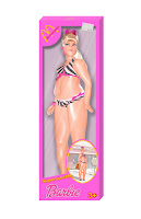
I made the box by using the rectangle selection tool to create a reasonably sized rectangle for the barbie. I chose a pink that matched her bathers and colored the box in. I then used the selection tool to remove a rectangle inside the box to show the barbie. I used the circular selection tool and the polygon selection tool to create the angled edges and circles in the box. I created the bottom and sides with the rectangle selection tool. I made them a reasonable width for the barbie, then skewed them to the proper angle using the measurements. I altered their saturation and lightness accordingly. I created a solid grayish pink background and added a drop shadow to the barbie, and the front layer of the box. I cropped a McDonalds logo from a solid background and added a drop shadow. I use text to create Barbie and Supersize Me, then applied an outline and shadow. To make the image in the bottom right circle, I removed the inside of the circle and put an image of a McDonalds in the circle with Barbie over it and added a shadow to her. I made the plastic on the box by creating a layer and using a gradient fill with white to background and low opacity. I then added a new layer and used white to draw lines of different width across the box and then blurred them and lowered their opacity to create the glare. I made the price tag by coloring a rectangular selection a pink-ish gray and applying a texture to it. I used a text i thought comparable to an actual price tag and added the text. I rotated the layer accordingly then added a drop shadow.

CONCEPT:
I wanted to create a toy that wouldn't be purchased because it sends a poor message. If children are playing with McDonalds Barbies that are extremely large compared to the idealistic Barbie figure, it sends a message that Barbie is ok fat. Little girls play with skinny, pretty toys and they want to look like them. If they are playing with large toys, they may be more accepting of their bodies and be reassured that it is ok to eat fast food, even if you gain weight.

COMPOSITION:
I selected a Barbie with an angle that would enhance her enlargement the best. I tried to make the box fit very snug to her, but not so much that you couldn't see her features or seem unrealistic. I replaced the usual Mattel logo with the McDonalds M because McDonalds is associated with obesity and they also have the "Supersize" option, which is what I was playing off of. I kept the box as close to the original Barbie boxes (inspiration) as far as color and design was concerned. I added a few McDonalds colors to amplify the fact that this Barbie is McDonalds, not any other company.

Special Edition Blog


Art Institute


3 Artworks that inspire me & their Craft, Concept, & Composition


CRAFT: Adriaen van der Spelt & Frans van Micris collaborated on Trompe-l'Oeil Still Life with a Flower Garland and a Curtain. The artwork is done in oil paint on panel. Adriaen van der Spelt made the original painting and then Frans van Micris added the shimmering curtain.

CONCEPT: Dutch collectors sometimes use curtains to protect particularly exquisite paintings. The creators of this image alluded to this. The title Trompe-l'oeil means "deceive the eye" which is what the painters were trying to acheive with the curtain. It almost looks like you could grab it and pull it back to reveal more of the painting.

COMPOSITION: The flowers and garland appear to be obviously a painting but the curtain looks incredibly realistic and draws the eye to it. It obscures a third of the background painting making the viewer imaging what the remainder of the painting may look like. The background is darker and more subtle colors which makes the shimmery curtain pop out.


CRAFT: Jacques-Antoine Volaire, The Eruption of Vesuvius, 1771. The painting is one of many that the artist did of the eruption. It is done in oil on canvas. There is a contrast between warm and cool colors in the image. The entire image is relatively dark, but the lava illuminates the left portion of the painting, where the moonlight illuminates the sea on the right portion. The canvas is fairly evenly shared between both scenarios, though the volcano seems to be encroaching upon the serene night by the way the artist trailed the smoke and lava river.

CONCEPT: Vesuvius was a popular attraction for travelers on the Grand Tour of Italy. During the time of the painting, there was much reflection of the volcano's activity at that time. There was a major eruption the year this work was painted. This painting was also fueled by the Enlightenment interest in science and philosophy and literal notions, such as the terror created by nature.

COMPOSITION: The artist draws the eye to the spectacular eruption of Vesuvius and then leads it to the sea, where the lava is cooling. The right have of the image is very peaceful, where the left is using more destructive colors. Silhouettes of people who appear to have made it to safety seem to be spectating. The couple in the bottom right look to be climbing the hills with the ones in the center looking in shock and awe. The individual at the far left looks to be recording the events, perhaps mimicking the artist.

CRAFT: Conrad Felixmuller, The Death of the Poet Walter Rheiner, 1925. The painting is in oil on canvas. The entire painting is very dark and chaotic, yes seems to glow from within. There is a lot of action taking place in the background developing the city of Berlin. The painting is very stylized with many angles. The lighting plays and important role and rather than being subtly blended to create the glows, the artist used what seems like swift, solid lines in bright colors to emulate the glowing.

CONCEPT: Felixmuller painted the image after learning of his friend's death. The man is falling against the chaotic background of Berlin representing the struggle of the individual in the modern world. The artist inserted his face in place of Rheiner's to relate his own inner conflicts about the postwar (WWI) existence. The portrait represents the Weimar Republic's political and social urgency and suggests the romantic danger of the modern metropolis. The poet's plunge demonstrates the fall of Germany.

COMPOSITION: My eye is naturally drawn the the hand gripping the curtain and then the distraught face. I then follow down the body and notice that it seems to be falling away out of the window. The artist used inky lines and developed a nocturnal glow that contributes to the sense of ghostly-ness and chaos.

Tuesday, October 19, 2010

Week 9 - Misfit Toy Draft 1

Barbie - Obese edition

Craft: I took an image of Barbie and used the magic wand and magnetic lasso to remove her from her background. I cleaned up the edges with the eraser tool. I created separate layers her head, stomach, chest, each arm, and each leg and used distort and liquify to obtain the size results. I used clones of the original bathing suit and shoes to create the new ones. For Barbie's chubby face, I duplicated her chin and then added a shadow using the paint brush and gaussian blur. I found an image of a Barbie box and used the rectangular selection tool to remove it from the background. I then used the magnetic lasso and polygon lasso to remove the contents of the box. I created a separate layer behind the box to make the background. I sampled the color from the original box and then added the shadows by duplicating Barbie and the box edge, decreasing their value, applying gaussian blur, lowering the opacity, and repositioning them accordingly. I then used the text tool and found a font that I felt suited the Barbie and added "Obese" below the Barbie text on the box. I sampled the colors from the word Barbie. I applied an outer glow to the text in white to create the outline. To create the glare on the plastic, I created a new layer and added some diagnol white streaks of different widths, then blurred them and lowered their opacity to get the desired effect.

Concept: I was thinking about toys that nobody would buy or want their children to play with. I also considered things our society is currently encountering. You never see fat play toys, especially Barbies. However, Barbie is unrealistic because nobody looks like that. I don't think children will want the misfit Barbie, and I know that parents are not going to encourage their little girls to play with a pudgy Barbie. After all, what could that encourage? Advertising and selling an obese Barbie is promoting acceptance of obesity and my concept. Obese Barbie teaches little girls that obesity is acceptable. I would like to make this a McDonalds theme with the catchphrase "Supersize Barbie!"

Composition: I used an angle of Barbie that I felt maximized her size. I over-exaggerated her stomach and hips because I wanted them to be the focal point and I also knew they would fall in the middle of the box. The first thing I want the eye to notice is the size of Barbie's waist, then the rest of her, and finally the box. I intentionally left her chest small in order to accentuate the size of her belly. I also made her lips and nose smaller to make it seem like her cheeks are pudgy also.

Source Image Locations:

Week 8 - Misfit Toy Shoot

Craft: I used a GE 12.2 mp camera with and without flash to take various pictures of toys from Toys R Us. I tried to get straight forward angles on toys in packages for sake of editing. I did my best to get shots with and without the light reflecting off of the package.

Concept: I had several different ideas going through my head, so I was taking pictures of a little bit of everything. I had two main themes with the images above; a very morbid easy bake oven centered around WWII, and the idea of an obese Barbie. I took pictures of the various easy bake accessories so that I could cumulate them into the final WWII easy bake set. I intended on doing the packaging for all of my ideas, rather than the product itself.

Composition: I was aiming for simplicity. I tried to get the plainest packaging for all of the images I shot so that the message wasn't buried. Should I select the WWII route, I'm going to alter the packaging to convey a war theme. The children on the boxes will have German soldier attributes applied to them and the baking accessories will be Jewish themed. I intend on photographing some cookie cutters and reshaping them. Should I select Barbie, I'm going to thicken her up and place her back into her original box and title it "Barbie - Obese." I may theme the box, I've not decided yet.

Monday, October 4, 2010

Week 7 - Distraction

#1

#2#3

If nobody has read any blogs, week 7's should give them everything they need. Title in this blog

CRAFT:
To create the above images, I first took various poses of Laura, a head on shot of the teddy grahams, and a photo of an old computer keyboard. I used the magnetic lasso to cut Laura out of the background, then a soft eraser to clean up the edges. I was able to use the magic wand and the soft eraser to remove the teddy grahams. I then applied numerous filters (sumi-e, dark strokes) to the keyboard in order to make it look more pronounced and not as dusty. I used brightness/contrast/hue/saturation on all of the separate images in attempt to make them flow together better. I had to pay extra attention to the teddy grahams because they were photographed against a very bright green background, thus yielding a green glow. I simply removed all of the color from them and then selected variations until I got the color I desired. Specifically, to create #1, I desaturated the keyboard and used variations to obtain a color that I felt complimented the image. The pairings of teddy grahams and Laura were aligned to make the teddy actually look across from her. The grouping furthest away has the strongest gaussian blur applied and I also decreased the value the most. The middle pairing is intermediate, and the closest pairing has no blur, but the saturation was slightly increased. I used the eye dropper to sample the color of the shadows on the keyboard and then selected a soft airbrush to create shadows under the teddy grahams and Lauras. In #2, I used the gradient filter on the background layer to create the interesting color contrast. I grayscaled the teddy grahams and Lauras and used curves/levels on them to create the level of contrast I thought looked best. I duplicated the teddy grahams and applied various levels of the motion blur to the bottom layer. For image #3, I desaturated the background and altered the brightness/contrast to suit the rest of the image. The teddy graham and Laura pairing furthest away has the saturation, contrast, and brightness increased, while the one closest is slightly desaturated. I also created a layer under the teddy grahams and used a soft white airbrush to create a glow.

Concept:
When working, we are exposed to distractions, such as hunger.

Composition:
#1: I positioned the teddy grahams directly in front of Laura so that it was evident that she was looking at them and not blankly into the distance. I placed one teddy graham in her hand to give the impression that she intends on eating it. I darkened and blurred the pairings furthest away to to develop death. Ideally, I wanted the furthest pairing to be examined first, but after creating a couple versions of the image, I feel that this version has the best feel to it.
#2 I decided to do something abstract by making the subjects of the image monochrome with a vibrant background. I feel like it gives the image a very different feel--it seems more retro. The blur of the teddy grahams also makes them seem unattainable. The pairing closest is the lightest, thus noticed first.
#3 By graying the background, the subjects stand out significantly more. My eye naturally goes to the pairing the furthest away due to the intensified color, then to the middle, then the closest. Following the order makes it seem like Laura is working, then notices something, and ultimately is reaching to obtain what she was distracted by. The glow around the teddy grahams makes them stand out.